words Al Woods
We already talked about art therapy and its benefits, but you might continue your journey and try to add colors to your everyday life.
An excess of yellow in a living space can have an overstimulating effect on the psyche, but in the right dosage, it can compensate for the lack of sunlight, visually warm any room and energize you. Due to its exceptional properties, warm and positive yellow regularly returns to interior fashion. Today, saturated active yellow shades are in trend. We will tell you what colors to combine with them in the interior.
Yellow + gray
First, let’s turn to the choice of experts. In 2021, the Pantone Color Institute has chosen two of the leading shades of the year at once. The main thing in this pair was the sunny yellow color with the life-affirming name “Illuminating” (“Illuminating”). As companions, it was picked up by the calm and practical “Flawless Gray” (“Ultimate Grey”).
According to Pantone, this color tandem should charge with optimism and be associated with fortitude.
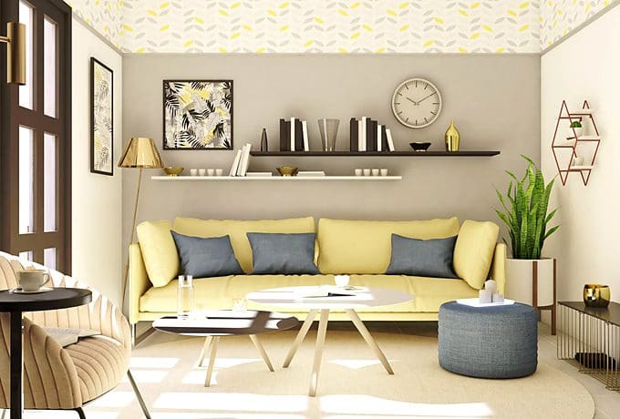
The duo of yellow and grey, and until last year’s selection of Pantone, was a very popular phenomenon. But if earlier the active yellow color mainly served as a bright accent, today it can be used on a large scale, balancing the dominant nature of the sunny hue with discreet gray “strokes”.
Yellow + green
An anti-stress combination conceived by nature itself. This pair can be juicy and contrasting, like yellow dandelions in young grass. This solution is suitable for bold interiors and trendy color blocking.
A more neutral and versatile option: a combination of muted light shades of both colors. It feels fresh and soothing.
Yellow + purple
A combination of two opposites. Both colors are active, both “with character” and their union turns out to be very expressive, and if you choose the right shades, then it’s not annoying.
Yellow color can be “friends” with almost any shade from the purple “family”: lilac, lavender and fashionable this year “Very Peri”. Colors won’t clash if you avoid their neon dazzling versions in favor of saturated and muted options.
Yellow + wine color
Another union of opposites. Deep vinous tones contrast beautifully with dark spicy yellow tones. It turns out a very noble “rich” combination, associatively referring to oriental interiors.
The combination of two saturated shades also looks good in color blocking, you can even add a third contrasting color to this pair.
Yellow + pink
Very tasty, vitamin and positive combination, reminiscent of tropical fruits and flowers.
This color pair can be characterized by some infantilism, which can be got rid of if you choose muted shades of pink.
Yellow + white
The sun and white cumulus clouds are a warm and clear color mix. With its help, you can “illuminate” even the darkest room, the windows of which look strictly to the north or are completely absent.
The abundance of light shades will visually expand the space, and thanks to the warmth of yellow, the room will not be associated with a sterile hospital ward, even if decorated in the spirit of radical minimalism.
And also in the paid with white, you can use the brightest and most neon shades of yellow.
Yellow + earthy and woody tones
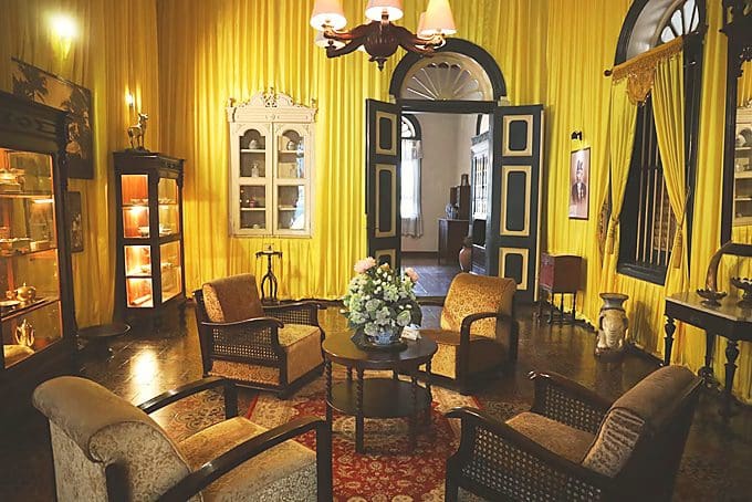
The sunny shade will perfectly blend into the neutral natural color scheme. It works well with sandy and earthy tones, ranging from neutral beiges to deep reds that resemble sun-baked clay.
A worthy companion for yellow will also be warm shades of different wood species. You can pay attention to the online furniture outlet that has a wide choice of wood furniture items. Such a color mix will turn out to be very “warming”.
When choosing yellow, you need to keep in mind that it will attract a lot of attention to itself and can become both your best friend in the interior and an annoying neighbor. Remember the reasonable dosage.
