words Alexa Wang
The choice of color, perhaps, is nowhere so relevant as in the nursery. After all, the perception of colors in children is much more sensitive and significant than in adults. What palette do you prefer to make the space comfortable for the child?
Trying to make the nursery not boring, you should not turn it into a test specimen for design experiments. Besides, it’s time to leave the “pink-blue” model too. We shared some tips on how to choose the right colors for a children’s room today.

Bright or neutral?
The color scheme influences not only the attractiveness of the interior but also the mood and even the well-being of the child. Psychologists noted that the taste of the child changes over the years. If at the age of 5-9 years children usually prefer such bright colors as red, pink, purple, then later, closer to adolescence, they tend to give preference to green, yellow, beige. Therefore, the best way out here is to use bright colors locally, which means to make color accents on individual elements of the interior, while keeping the background neutral. This will allow not only to balance the space but also subsequently easily part with these objects or replace them with others at the stages of growing up of the child.
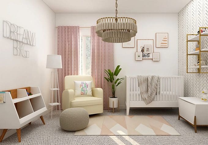
Try not to experiment with the discordant tones, nursery isn’t the best place for your creative attempts. Better to be in the range of the two main colors that can be diluted with the white or beige shades. This combination makes adds airy flair to the room, which is an essential criterion for a good nursery.
Good tone
Many designers have said more than once that adhering to classic gender stereotypes in the design of a nursery is a sign of bad taste. Whereas soft, light, and warm shades are much more favorable than radically cold blues and boiling whites. But overdoing it with “warmth” is also not worth it, especially with bright versions of yellow and orange in the bed area. Yellow shades are too energetic and can interfere with the rest colors, but in the play area of the nursery, they will be very useful. If your child really likes pink or blue, opt for the soft, intelligent shades of these colors. If pink it should be closer to cream or peach, if blue it is better to be dull, heavenly, or cornflower blue, with an admixture of a warm tone.
New Scandinavian
Nowadays it is very popular to use the mood of the Scandinavian interior style in children’s rooms: it is simple and laconic, it welcomes environmentally friendly materials, cozy fabrics and light colors. But many designers and parents are wondering – is the Scandinavian “coolness” of white tones appropriate for a nursery? Now the so-called “new” Scandinavian style is gaining momentum, where the main color is not the usual boiling white, but completely different shades of the spectrum. Yes, they remain discreet and calm, but they bring a completely new character to such an interior, which is very beneficial for a nursery. It can be sage green, salmon, gray, lemon, and other interesting colors. To find furniture pieces in the new Scandinavian style you can go to Homey Design Store.
Ask me
A very important point in designing a child’s room is that it should really be liked by the child. Therefore, as a designer and as a mother, I sincerely advise – be sure to ask your child’s opinion about the color of the room. But at the same time, always offer options for choice, to which you can incline yourself. So you will take into account the wishes of a small but such an important family member, without making a critical mistake in choosing a shade. The question “What color should I paint the walls of the nursery?” does not make sense – it is more correct to formulate it like this: “Do you like this green or this orange better?”

Light and dark
It should be remembered that the location of the nursery relative to the cardinal points also plays an important role. The amount of daylight, or insolation, is very important for the physical and mental health of the child: constantly staying in a gloomy, unlit room, the baby may experience discomfort, drowsiness, and depression. Accordingly, if the windows of the room face north or west, choose light and warm colors, add brightness. A southern or eastern nursery is more conducive to cool shades, in any case, they will not look dull.
When it comes to the choice between light or dark shades the first one surely is a winning one in the competition. Light colors without doubt create an atmosphere of relaxation and comfort, and these shades are easier for perception and can become a perfect combination with bright color accents. It doesn’t mean that you should exclude dark colors from your choice, it just means that you should be careful and attentive with them.
Attention should be shown also to the achromatic palette that can be tricky when it comes to the nursery. Grey, white and black colors should be used thoughtfully and shouldn’t be used in their “pure” variant. The contrast of the strict black and white color combination will not bring positive vibes and thoughts to the smooth child’s mind. Children need colors because it is closer to their worldview and color perception, in childhood all is brighter and lusher than in adulthood.


