5 tips for choosing your wedding invitations
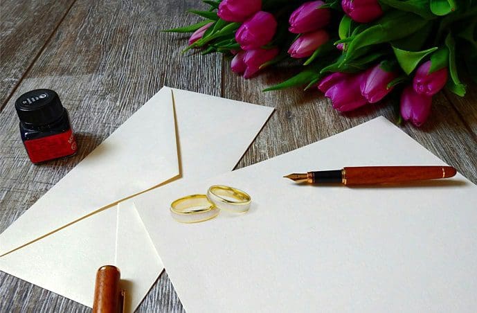
Think of your wedding invitation cards as your first impression to your guests. It gives them a sneak peek into your big day, which everyone will be anticipating. To illustrate the look and feel of your day, wedding invitations are a great way to set the tone of your event.
There’s a lot of preparation that goes into wedding invitation designs before you send them out. From colours, themes, size and shape, here are a few tips to consider so that you deliver all the information your guests will need in style.
What’s your wedding theme?
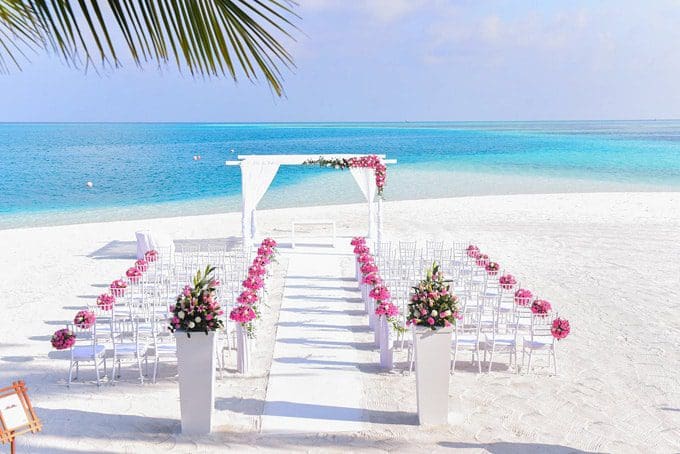
If you’ve already chosen your venue, decoration and food, you most likely have an idea of your wedding theme. Are you having a spring daytime wedding? Then vintage florals and curly calligraphy will make a sweet invitation card. How about a beach wedding? Touches of ombre blue and white will bring interest to a seaside setting.
Design your wedding invitations according to the season as this will spark creativity and allow your guests to get a feel of the big day when they open the invitation.
What’s your colour scheme?
To create invitation cards that are unique to your wedding’s setting, match the colour choices you have in place with your venue and décor. Sometimes less really is more. So, if your wedding theme includes lilac and sky blue, you probably shouldn’t choose gold or rustic colours. If you have a floral themed wedding, then think about swapping some of the obvious shades in the same hues with classic creams, for a fresh take on a modern style.
Get specialists to guide you through the design process. You can be as creative as you like when you choose wedding invitations by Downey, as they can help you make the perfect invitations to illustrate you and your partner’s personality.
Choose a font style
One of the most important parts of designing a wedding invitation is choosing the font as this will determine its overall look. Avoid the default fonts like serif and sans-serif fonts. Instead, do your research and look for a quality font with a unique design.
As mentioned above, you’ll want to make sure your font style and background colour aren’t too similar. If you’re having an elegant style wedding, bold italics can end up looking too heavy, whereas a script or calligraphy font will look easier on the eye and glide beautifully on the paper.
Consider printing your fonts first to make sure it looks just as good on paper as it does on the screen.
Choose your paper
This part of the wedding invitation design can be a fun task and will allow you to visualise how everything will look. The weight and texture of the paper you’re using will affect how text and design sets.
Matte paper is a common paper finish and extremely versatile when it comes to printing bold fonts and pastel colours. Whereas glossy paper is great for printing colourful wedding invitations for bright pops of colour.
The standard wedding invitation size is 4.5-inch-by-6.25-inch, but feel free to experiment with different shapes and sizes.
Organise your information
Wedding invitation cards are the perfect way to ensure your guests have all they need to enjoy your wedding day to the fullest. Below will help you decide which information you want to include and make sure it is laid out clearly for your guests.
- Names of the couple
- Date and time of the ceremony and reception
- Names of the wedding venues
- RSVP contact details
- RSVP deadline
Planning a wedding can be daunting, so get as much help and advice as possible. For invitation cards, wedding stationery by Downey can take the pressure off your shoulders so you can focus on other areas.


