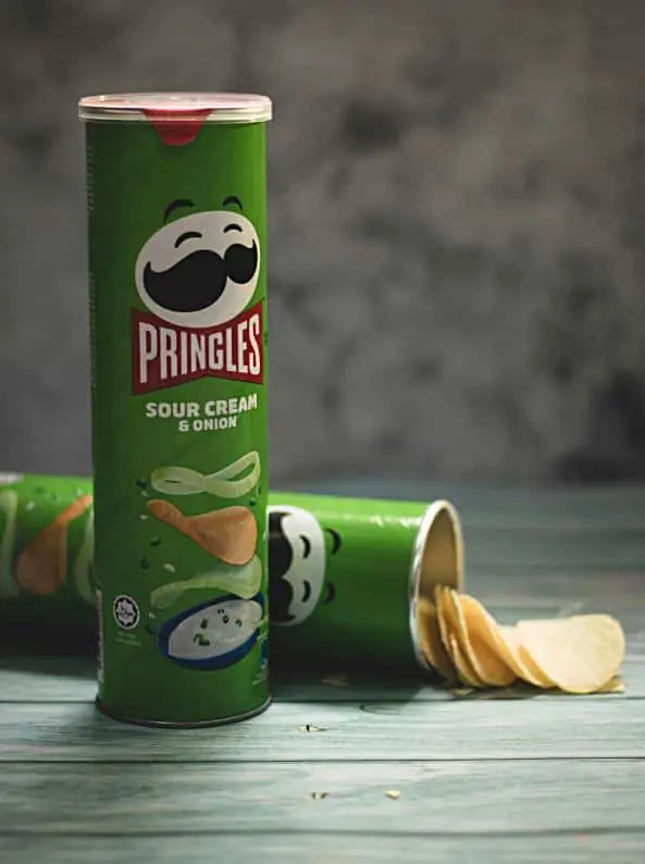
Packaging design shouldn’t be an afterthought. In fact, many products are successful largely because of their packaging. Consider the iconic Pringles tube or the Coca Cola bottle – a big reason as to why these products sold so well is because the packaging looked good.
Of course, successful packaging isn’t all about appearance. There are a lot of factors that go into designing packaging from making sure that it doesn’t get damaged during transit to keeping it environmentally-friendly. This post delves into some of the important factors to consider when designing packaging to help you deliver a winning product.
Size
Getting the size of packaging right is a delicate balance. If your packaging is too compact, it could make the product hard to remove and increase the risk of it getting damaged. Meanwhile, oversized packaging means more money spent on materials and increased storage/delivery space needs.
Compare the size of other products similar to yours to make sure your packaging is neither too large or too small. If you’re deliberately selling a product that is bigger or smaller than rival products, then you will need to make sure you make the same adjustments to your packaging.
Aesthetics
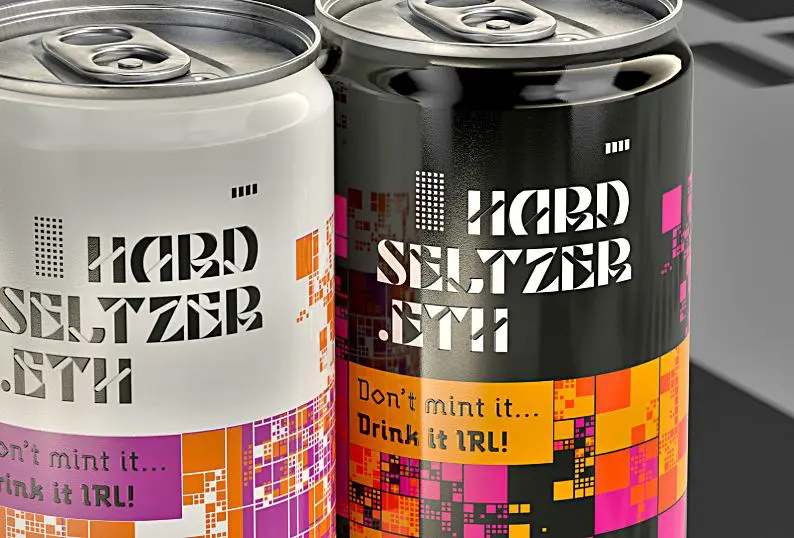
Aesthetics is probably the most important aspect of packaging when it comes to products displayed on a shelf. Eye-catching colours, unusual packaging shapes and striking logos will all help to attract people’s attention. If you don’t consider these features, your product may fail to sell – no matter how amazing the product itself is.
Of course, choosing the right visuals isn’t all about grabbing people’s attention. You need to also consider the connotations of certain colours, fonts and images. Black for example can be a symbol of luxury or a symbol of death – the imagery and fonts you use with it will determine whether a consumer sees your product as sophisticated or gloomy. It’s also important to make sure that the aesthetic you use on your packaging is consistent with the rest of your brand (your website and adverts shouldn’t use different colours, fonts and logos).
Clarity
It needs to be clear what your product is. You also need to make it clear how to use your product and when to use it. This is something that companies can fall trap to when trying to be a bit kooky with the design or when designing it on the cheap.
First things first, images need to be high quality and text needs to be readable. Pay professional photographers to take high quality photos if you need them and avoid using fonts that are overly flowery or too small. Next you need to consider the content of these images and text. If you’ve used a green symbol to look like a leaf on your packaging, is it clear that it’s a leaf? Meanwhile, text needs to be well written and contain all the essential information that could be useful to someone wanting to buy your product from the shelf (such as clear instructions, what parts are included/ingredients and who the product is aimed at).
Durability
Packaging needs to be robust enough to keep the product intact during storage and transit. Different materials and shapes can offer different levels of durability, which is something worth exploring. It’s important to consider the conditions that product needs to be stored in too. If you want to stop a product getting too hot, you may have to consider packaging that can stay cool or provide ventilation. If the product can’t get wet, waterproof packaging could be essential.
When packaging loose items, it’s important to make sure that these contents are kept secure from movement so that they don’t get damaged. There are a few different ways to pad out products for delivery such as using bubble wrap or polystyrene. With products that you want to display on a shelf through clear packaging, moulded inserts and strings/cable ties can be a better way of holding products in place.
Health and safety
Health and safety is another important element of packaging. Packaging should be designed in a way that protects the consumer from harm. This includes making sure that the packaging itself isn’t sharp or heavy, as well as making sure that consumers know how to use the product and that the product is kept in a safe condition.
There are certain health and safety requirements that all product packaging must abide by. When it comes to text information on the packaging, this includes things like warning consumers of allergen ingredients or clearly stating the expiry date. Other features may be recommended on certain products. For example, child resistant caps are something that pharmaceutical packaging companies can incorporate into bottles of medication to prevent accidental poisoning if a child gets their hands on your product.
Accessibility
Features like child resistant caps are somewhat of a double-edged sword – while they can save kids’ lives, they can also make packaging harder to get into for consumers with disabilities. In fact, many forms of modern packaging can be difficult to get into in an attempt to keep them safe and secure. Many forms of packaging require consumers to use tools like scissors or can openers to get into. This is something that has started to anger many consumers, and some companies are therefore altering their packaging to make it more accessible and more appealing to these consumers. This includes using easily-located tearable perforated lines on cardboard packaging and simple pull rings on metal cans.
When thinking about accessibility, it’s also important to consider the ‘unboxing experience’. It’s not just important that packaging is easy to get into – it should also create a sense of excitement so that the customer isn’t disappointed when they open it. For some consumers, there is a real buzz in opening a product, as evident by the many ‘unboxing’ videos online. Consider ways in which you can make the process existing such as presenting the product in a fun way or using secondary packaging (such as using an inner sleeve or wrapping a product up in paper) to create suspense.
Sustainability
One of the biggest changes in packaging in the last two decades is the overall attitude to sustainability. 20 years ago, it didn’t matter to many people if packaging wasn’t recyclable or biodegradable. Nowadays, more consumers are deliberately seeking out products that don’t use plastic or can be recycled. And new regulations are constantly being introduced to further push companies towards sustainable packaging – such as taxes on plastic and bans on certain types of packaging.
Cardboard/paper has become one of the most popular materials for packaging because it is both recyclable and biodegradable. CDs no longer come in plastic cases, but instead cardboard sleeves. Meanwhile, takeaway meals now commonly come in cardboard containers instead of plastic tubs. Many companies are still using plastic of course, but this is generally always recycled plastic. Metal and glass meanwhile remains popular due to its similar recyclability.
Tessellation
Tessellation is when shapes fit together perfectly. Not all packaging tessellates, however most packaging is designed to fit together as snugly as possible with few gaps. This allows products to be more easily stored and transported in bulk.
Squares and cuboids are the most popular shapes for packaging because they tessellate well. More rounded and obscure packaging shapes can stand out on the shelf, but can be more difficult to stack and store together. This is an important thing to consider if your product is likely to be stored and transported in bulk.
Weight
Some packaging materials are heavier than others. This extra weight can affect cost and storage limits when transporting your product. Weight can also affect how easy the product is to carry and handle. This would suggest that it’s always better to choose light packaging. But there are times when lightweight packaging isn’t a good idea.
Heavier packaging is often necessary when supporting heavy contents. Heavier packaging can also have an impact on how high quality a product feels – studies show that adding weight to the packaging of jewellery or perfume can make it feel more premium and high-end. Lighter packaging could make a premium product seem lower quality and overpriced.
Cost
Finally, it’s important to consider how much money you are spending on the manufacture of your packaging. This depends a lot on the materials used, the inks/dyes used and the machinery required to build the packaging. If you spend more on the packaging, you’ll have to push up the price to cover this cost. If you have to increase the price too much, it will put off customers – which is why low-end products aimed at those on a tight budget often have very basic packaging.
By budgeting ahead, you can work out exactly how much you can afford to spend on packaging. You don’t want to be so tight that you end up having to settle for basic and boring packaging. However, you also need to avoid splashing out on small details that could greatly reduce your profis.


